Web Design
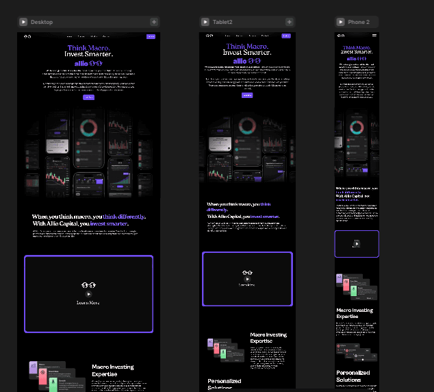
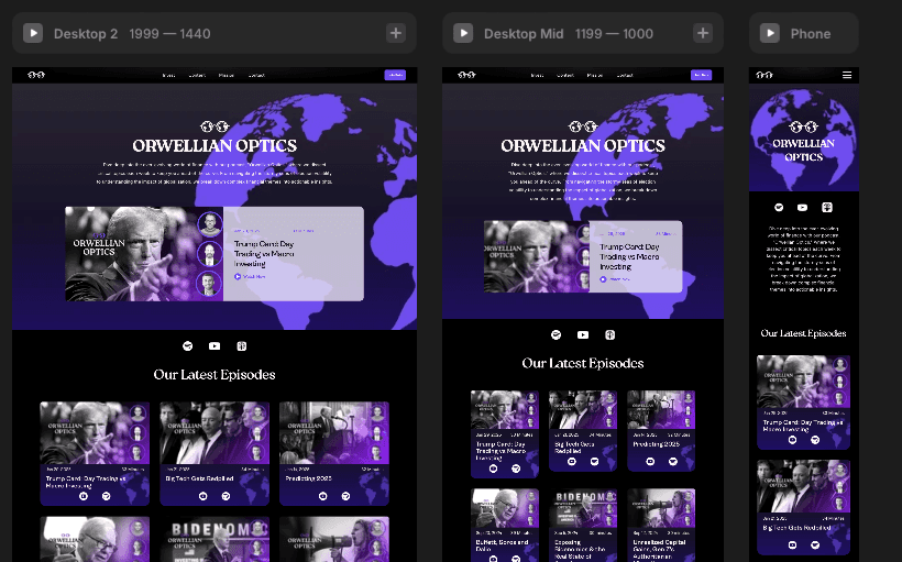
Exhibit one is the site you’re on, designed and built by me in Framer. The deeper case study is Allio:
ALLIO CAPITAL:
I designed Allio Capital’s marketing site to do one job: make a complicated investing product feel legible to a first-time visitor. Research and information architecture came first, then the visual system.
The build ran on Framer, WordPress, and HubSpot with a modular design system, so the team could ship new pages without breaking the brand. SEO and performance were handled in the build from the start.
After launch I ran A/B tests and heatmaps to find friction, and kept the site WCAG-compliant and responsive throughout. It held up: better engagement, better retention, and a site the team could maintain themselves.
Screenshots below.




YENDO PROJECT HIGHLIGHT:
Yendo is a fintech platform that lets users open a credit line against the value of their car, without giving up the vehicle. Unlike traditional title loans, Yendo positions itself as a modern alternative for people who need access to funds but want to avoid predatory lending. It offers up to $10,000 in credit with fast approval, no hidden fees, and credit-building potential through on-time payments.
Variant A: “Fast Track to Credit”
Goal: Position Yendo as a bold, product-forward, fintech disruptor
Tone: Energetic, confident, tech-savvy
Visual Approach:
Uses stylized, high-contrast illustrations
Incorporates modern, animated-feeling graphics
Leans on a dark mode section for credibility and sharpness
Showcases logos of major press outlets for trust
Key Messages:
“Fast Track to Credit” headline emphasizes speed and innovation
Strong contrast against title loans
Focus on product clarity and benefits
Clear CTAs and step-by-step visuals guide the user toward conversion
Target Audience:
Digital-first users who expect a sleek product experience and immediate clarity. Optimized for traffic from paid media or direct referrals, where trust must be established quickly and the value proposition made obvious in under 10 seconds.
Variant B: “No Credit? No Problem.”
Goal: Build approachability and trust among underserved or credit-anxious users
Tone: Friendly, human, reassuring
Visual Approach:
Features real people and warm tones
Relies on lifestyle imagery over stylized illustration
Uses clear, legible UI cards to explain benefits
Highlights emotional reassurance throughout
Key Messages:
“No perfect credit needed” meets the user where they are
Emphasizes that the user can keep their car and avoid high rates
Transparent benefits with no fine print feel
Testimonials add credibility through peer validation
Target Audience:
Users with little credit education, skeptical of lenders, or feeling excluded by traditional options. Ideal for organic discovery, SEO, or influencer referral traffic.

